


Your Home: The Power of Greige Paint
Posted on March 13, 2019 by Laura Lucky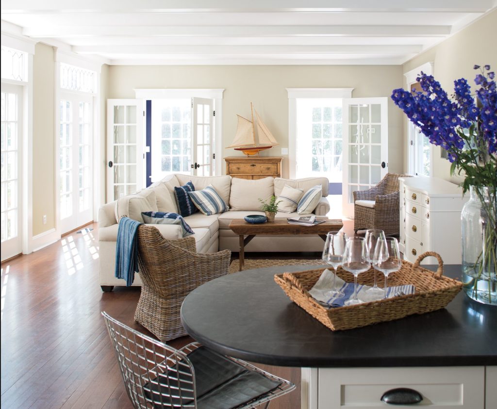
Adapted from: ElleDecor.com
Let’s be honest. A room that makes use of the color greige—a combination of gray and beige—probably isn’t your idea of chic, but Benjamin Moore Color & Design Expert Hannah Yeo deems the warm gray tone worthy of your attention. “Greige is classic for a reason,” Yeo says. “It’s a comfortable backdrop, especially for a paint color. You would be comfortable living with it year after year.”
While we still appreciate statement hues (hello, Pantone Color of the Year), there’s something special about a room that puts a timeless neutral, like greige, to the test. When used strategically, greige paint can have a transformative effect on a space. But before you grab your paint brush, consider these pointers from Yeo on the best way to showcase the beauty of this neutral shade in your space.
Embrace its versatility. According to Yeo, there really is no right or wrong way to use greige in an interior. It complements a range of architectural styles, hues, and spaces, from a nursery to a living room. One of Yeo’s favorite tactics is to pair a lighter-toned greige with a pop of color. “It can make a soft backdrop that almost disappears,” says Yeo. “It is so comforting and focuses on what is in front of it so you can add a pop of color, whether that is through furniture, an accent chair, framed artwork, or even a pattern in a throw pillow that will stand out against that soft, neutral background.”
Layer it with other neutrals. Once you incorporate greige into a design scheme with other neutrals, you can notice its true beauty. “There’s something magical about neutrals,” Yeo says. “Once you put different beiges and greiges together, you start to really see its undertone and personality in the color itself.” Plus, the simple act of layering greige with other neutrals adds depth to a room in a subtle way.
Go for texture. “The more texture—the more depth you create in the room—makes it more interesting,” Yeo says. The goal should be to aim for a balance of shiny and matte textures. If your wall has a matte finish, for example, Yeo suggests weaving in a satin fabric or patterned throw pillow. On the other hand, if you have a wall with a sheen finish, incorporate a bit of velvet or a matte fabric to juxtapose that.” This helps to create visual interest in the room and elevate the look of the space, Yeo advises.